Natural Stone Colors Choose Stone by Color
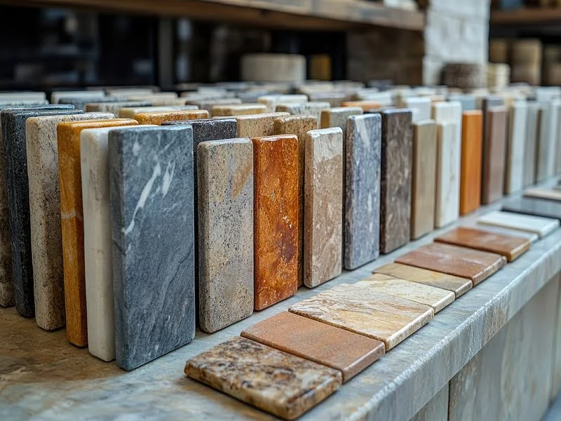
Explore natural stone colors by visual family, then use this guide to understand which tones work together, how lighting and surface finish change the result, and which combinations suit different architectural directions. Use the dynamic filters to continue from color guidance to actual Karimi Stone products.
- Color Range
- Light → dark
- Stone Types
- 05 families
- Selection
- Color + finish
- Supply
- Project + export
Stone Color Collection with dynamic project filters
Start with a color family, then refine the collection by geological category and surface finish. The results below stay dynamic through your existing WordPress taxonomy widgets.
Natural Stone Colors
Choose a color family to open the complete collection of matching natural stone products.
Natural Stone Colors and the atmosphere they create
Color is not only a visual filter. It affects perceived brightness, contrast, warmth and how strongly veins or texture are noticed. The notes below are practical design guidance rather than fixed rules: the final result always depends on the actual stone, finish, lighting and surrounding materials.
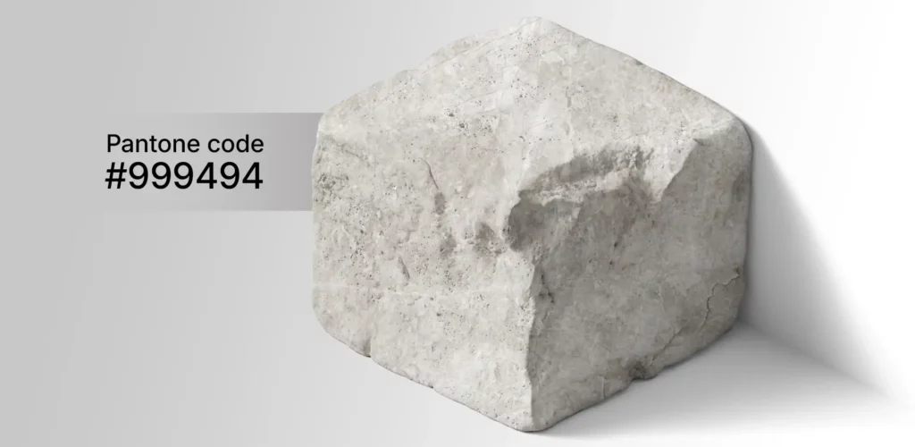
White & Cream
White and cream stones create the brightest visual range. They are useful when the project needs more reflected light, a calm background or a material that will not visually dominate other elements.
- Pairs well with
- Warm oak, walnut, black metal, brushed stainless steel, soft grey plaster
- Good for
- Façades, lobbies, bathrooms, residential interiors, large wall surfaces
- Watch for
- Cool white lighting can make warm cream stones appear flatter or more yellow by comparison.
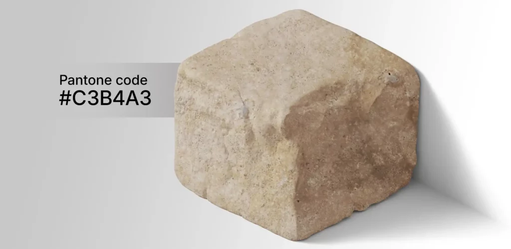
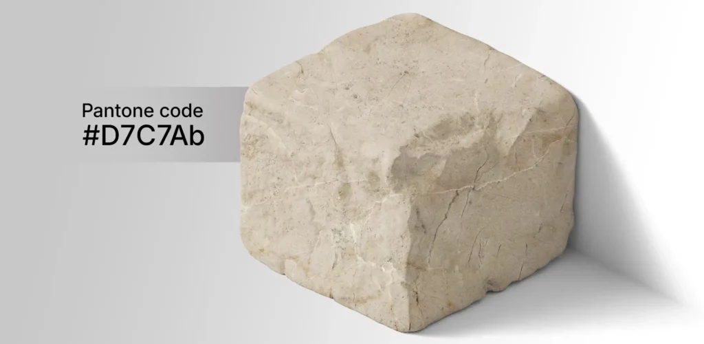
Beige & Sand
Beige is one of the easiest stone color families to combine with architecture because it sits between white and brown. It works particularly well where the design needs warmth without strong saturation.
- Pairs well with
- Natural wood, bronze, muted olive, off-white, warm grey, textured plaster
- Good for
- Villa façades, hospitality, flooring, courtyards, classical and warm-minimal interiors
- Watch for
- Very cool blue-grey materials beside warm beige can make both colors feel disconnected.
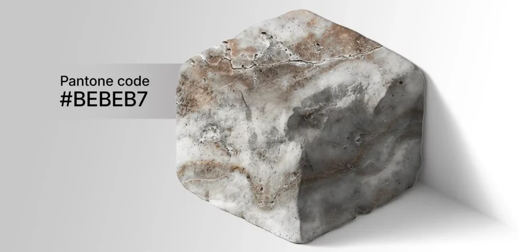
Grey & Silver
Grey and silver stones are strong choices for contemporary architecture because they can connect concrete, glass and metal without introducing a dominant warm color. Veining determines whether the result feels quiet or dramatic.
- Pairs well with
- Black steel, glass, concrete, white plaster, dark oak, stainless steel
- Good for
- Modern façades, commercial interiors, offices, urban paving, feature walls
- Watch for
- Silver travertine and grey marble may include warm brown movement, so approve the actual project range.
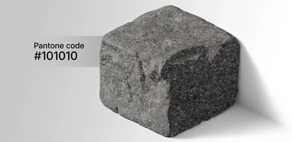
Black & Charcoal
Dark stone creates depth and contrast. Black granite and dark marble can become a visual anchor, especially when used beside lighter stone, timber or neutral wall finishes.
- Pairs well with
- White limestone, cream travertine, walnut, bronze, warm lighting, clear glass
- Good for
- Feature walls, reception desks, luxury interiors, stairs, high-contrast façades
- Watch for
- Highly polished black surfaces show reflections, dust and water marks more clearly than textured surfaces.
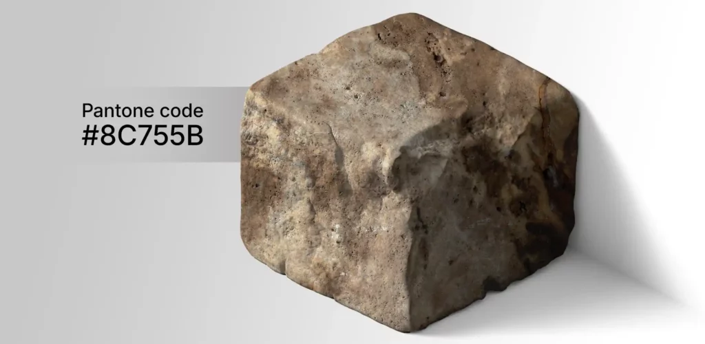
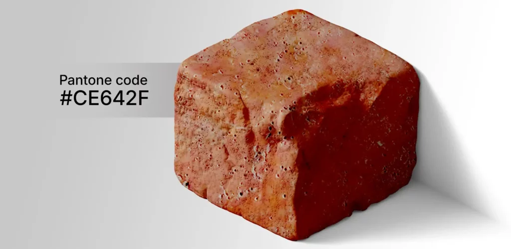
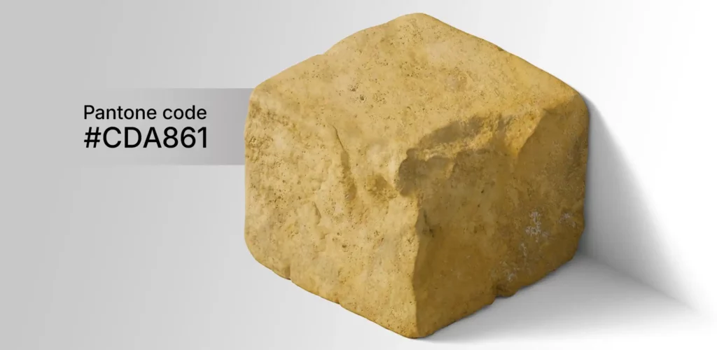
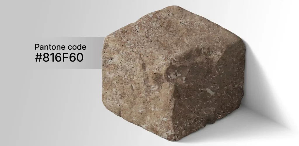
Brown, Red & Golden Tones
Brown, red and golden stone colors carry stronger mineral character. They work well when the design intentionally uses earthy materials rather than trying to create a completely neutral background.
- Pairs well with
- Cream stone, natural timber, matte black, bronze, sand-colored plaster, landscaping greens
- Good for
- Outdoor flooring, villas, landscape walls, hospitality, accent areas and regional architecture
- Watch for
- Use large samples: iron-rich movement and veins can make the full slab stronger than a small sample suggests.
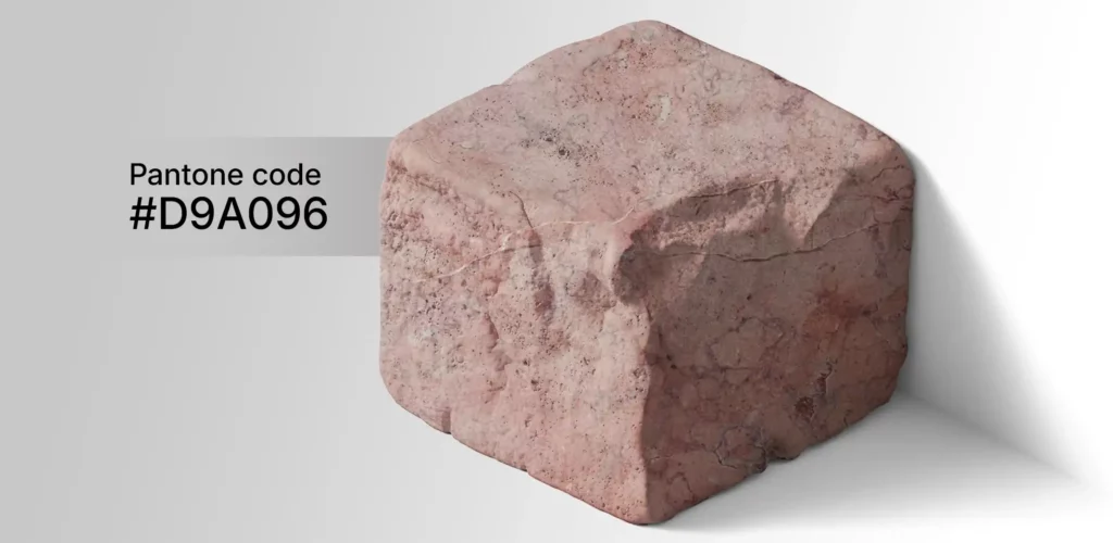
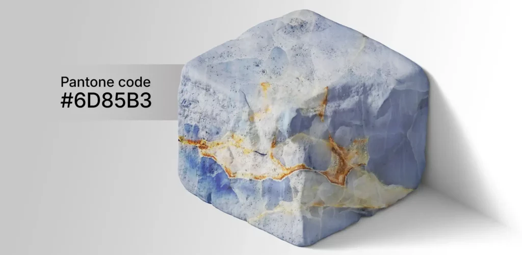
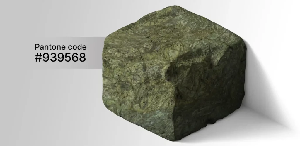
Green, Blue & Pink
Green, blue and pink stones are more distinctive and are usually strongest when treated as a deliberate feature rather than repeated across every surface. Their natural mineral patterns are often the main design element.
- Pairs well with
- Off-white, light limestone, restrained wood tones, brushed metal, simple neutral backgrounds
- Good for
- Feature walls, decorative panels, bathrooms, reception areas, furniture and custom stone pieces
- Watch for
- Keep adjacent materials quiet; too many competing veins and colors can reduce the impact of the stone itself.
What Stone Colors work well together?
The safest combinations usually have one dominant stone and one supporting material. Pairing becomes more difficult when several materials compete with strong veins, different undertones and high contrast at the same time.
Warm wood · Black metal · Grey · Bronze
Bright, balanced, easy to layer
Very yellow lighting with cool white marble
Oak · Walnut · Warm grey · Olive · Bronze
Warm, residential, hospitality-friendly
Strong blue-grey next to yellow-beige
Black steel · Glass · White · Concrete · Dark wood
Contemporary, architectural, restrained
Mixing several unrelated grey undertones
White limestone · Cream travertine · Walnut · Bronze
Strong contrast and visual depth
Using large dark areas without enough light
Cream · Sand · Timber · Matte black · Landscape green
Earthy, warm, expressive
Too many warm materials with different red/orange undertones
Off-white · Light stone · Neutral timber · Simple metals
Distinctive feature material
Another highly veined accent stone beside it
Do not approve a full project palette from website images alone. Compare the actual stone sample beside the flooring, wall finish, timber, metal and lighting that will be used in the project.
Stone Color under light, finish and water
The stone itself has a natural color, but what the eye sees is affected by surface texture, reflection, moisture and the color temperature of the surrounding light.
Natural Daylight
Use daylight as one of the reference conditions when approving color. It reveals undertones and vein movement more neutrally than a single artificial light source.
Warm Lighting
Warm artificial light reinforces cream, beige, brown and golden tones. It can also make cool grey stone appear slightly warmer in the finished interior.
Polished Finish
Polishing increases reflection and visual depth, so dark colors and veins can appear stronger and more saturated than on a honed surface.
Honed / Textured Finish
Honed, sandblasted and bush-hammered surfaces diffuse more light and often give the material a softer, less reflective appearance.
Wet Conditions
Many stones appear darker when wet. Exterior paving and pool areas should therefore be reviewed in both dry and wet conditions where appearance is important.
Large Areas
Variation becomes more visible over large floors and façades. Approve a range, not only one ideal sample, and define how much tonal movement is acceptable.
Choosing Stone Color by project direction
These combinations are starting points for material selection. The exact stone should still be checked against technical requirements, approved samples and the real project environment.
White + Grey + Black
Use a light stone as the main surface, grey for depth and black in smaller architectural elements such as frames, details or feature areas.
Cream + Beige + Wood
A soft combination for residential and hospitality interiors. Keep the undertones consistently warm and use texture instead of strong color contrast.
Grey + Silver + Glass
Useful for commercial spaces and modern façades. Add timber or cream elements if the overall palette starts to feel too cold.
Beige + Cream + Brown
Layer several warm neutrals with controlled variation. This works especially well when stone, timber and metal details share similar undertones.
Black + White / Cream
Use one material as the dominant field and the other as an accent. Equal quantities of two highly veined stones can make the composition too busy.
Green / Red / Pink + Neutral Base
Let the colored stone be the focal material and keep surrounding surfaces simpler. This gives natural mineral color and veining enough visual space.
Stone Color is only the first filter
After choosing the visual color family, the project still needs the correct stone type, finish, dimensions and technical specification.
Select the preferred visual range and compare available materials.
Confirm whether Marble, Travertine, Limestone, Granite or Onyx fits the project.
Review how the selected finish changes texture, reflection and perceived color.
Send the required color, stone type, finish, dimensions, quantity and destination.
Natural Stone Colors Frequently Asked Questions
Practical information for architects, contractors and buyers comparing natural stone by color.
Which natural stone colors are easiest to combine?
White, cream, beige and many grey stones are generally the easiest starting points because they work as neutral architectural backgrounds. The undertone still matters, so compare actual samples with nearby timber, metal, paint and other stone.
Which stone colors work best with wood?
Cream, beige and warm grey usually combine easily with oak and walnut. Black stone can create strong contrast with timber, while green or red stone is better used as a controlled feature unless the overall palette is intentionally expressive.
Should I match the stone to wall paint or flooring first?
Start with the least flexible and most visually important materials. If the stone covers a large façade or floor, approve the stone range first and then coordinate paint, timber and smaller finishes around it.
Does surface finish change how a stone color looks?
Yes. Polished surfaces are more reflective and often look deeper in tone. Honed and textured finishes scatter more light and can make the same material appear softer or lighter.
Why does stone look different in the showroom and on site?
Lighting, viewing distance, surrounding colors, moisture and the amount of material visible all influence perception. Review representative samples in the actual project environment whenever possible.
How should color variation be approved for a large project?
Approve a range rather than one ideal piece. Use several representative samples or a mock-up and define the acceptable background color, veins, mineral movement and other natural characteristics before production.
Need a Specific Stone Color?
Send the required color range, stone type, dimensions, finish, quantity and delivery destination. Our team can review suitable natural stone options and available project selections.